Creating a Form - Step Two (Editing a Form)
This article is to assist you with Step Two of Two in creating a form - using the Form Editor.
On the Forms page, you can create and edit a form, as well as keep track of forms and their responses. On the Settings page, you can edit Application forms and People Forms. Forms are a great way to gather information from users. Admins can create completely customized forms and then make them available to whomever they set. In Step One, you created the framework of the form. In Step Two, you will create the part of the form that the users will see and fill out using the Form Editor. Finally, you will test and then publish the form. This article will cover how to use the Form Editor to create or edit a form.
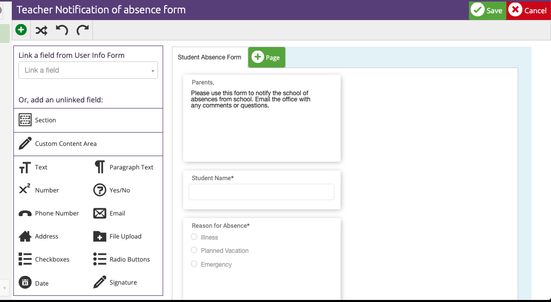
Four ways to enter the Form Editor:
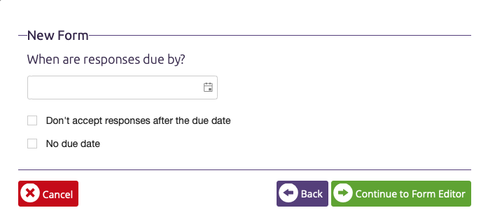
- A continuation of creating a form. When the basic framework of the form is completed, you will be presented with the button Continue to Form Editor.
- People Forms - there are four People Forms in ClassReach which can be edited to meet your school-specific needs. To edit these forms:
- Navigate to the Settings Page > People Forms
- Select the desired People Form and click to open the form
- Locate the form you would like to view or edit and click on it.
- Click the Edit Form button at the top right of the window.
- Application Forms - there are three application forms in ClassReach which also can be edited as desired. To edit these forms:
- Navigate to the Settings Page > Applications
- Select the desired Application Form and click to open the form
- Locate the form you would like to view or edit and click on it.
- Click the Edit Form button at the top right of the window.
- Any other time you would like to edit a form from the Forms page, follow these steps:
- Navigate to the Forms page at the top of your screen.
- Navigate to the All Forms tab in the center of the window.
- Locate the form you would like to view or edit and click on it.
- Click the Edit Form button at the top right of the window.
Form Editor Overview
Once you have entered the Form Editor, you have the option to:
- Create/Edit Pages
- Create/Edit Data Fields
Create/Edit Pages of a Form
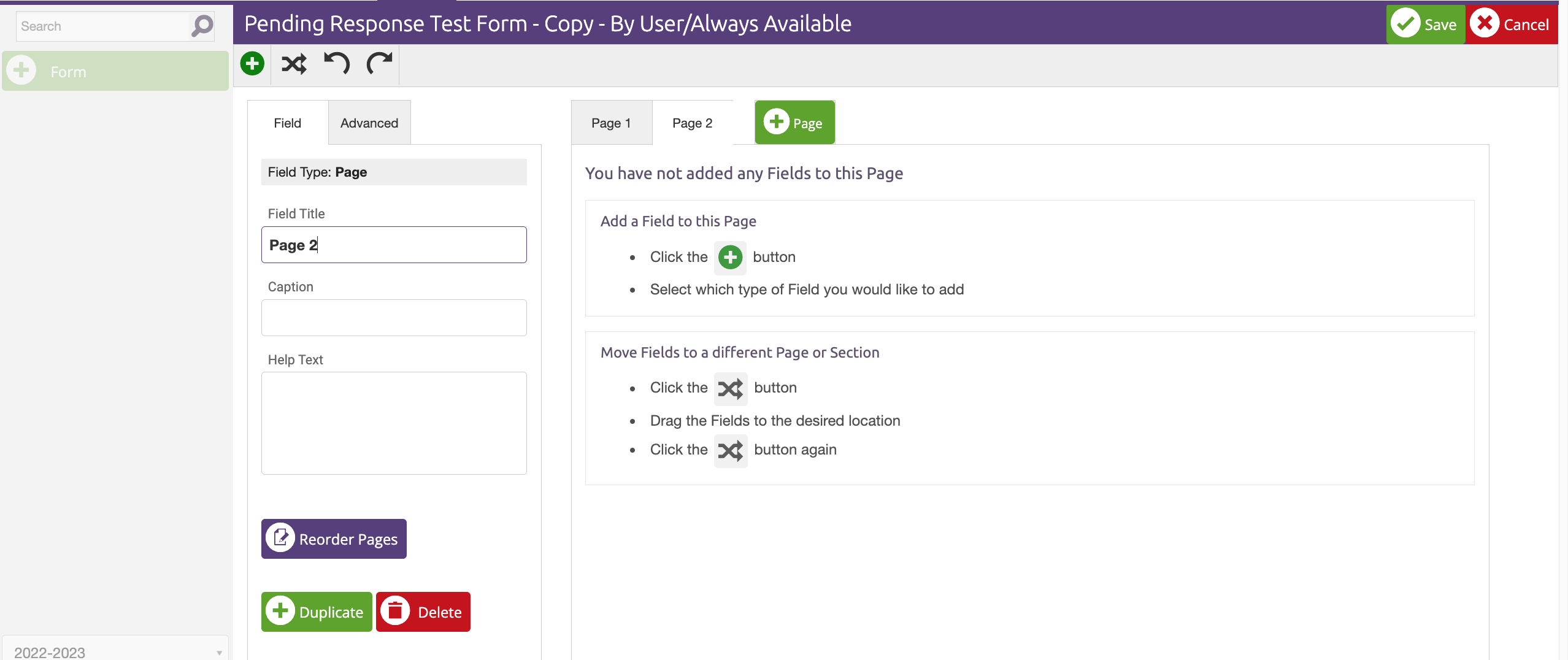
You can create multiple pages for a form. When a user completes a form, they will have to click Next to go through each page (we recommend limiting your pages to no more than 5 so all pages are visible to Admins-too many will scroll off the page.)
- To add a new page:
- click the green +Page button next to the current tabs.
- To change the page settings:
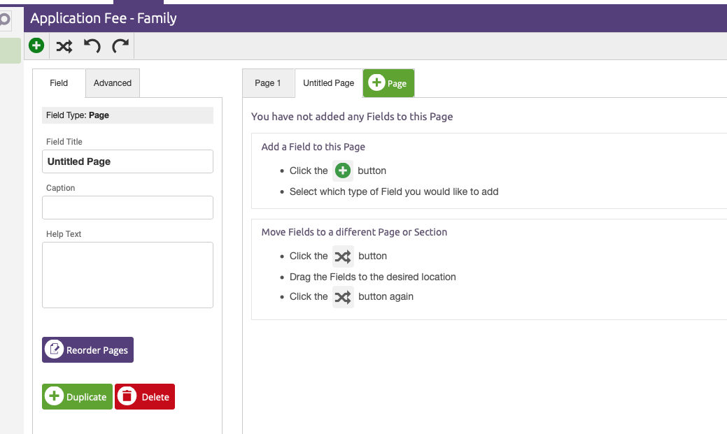
-
- Click the page’s tab at the top of the form.
- In the field editor on the left you can change the settings.
- In the Field tab:
- Field Title: The title of the page as it appears to users.
- Caption: Subtext to your title.
- Help Text: A field to let your user know whether they need certain information to complete this page, or any other information you would like them to know. If you add Help Text, a small "?" will appear next to the Field Title.
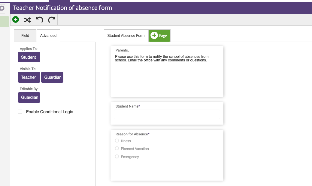
- In the Advanced tab:
- Applies To: Choose to whom the page applies.
- Visible To: Choose who can see the page after it has been completed.
- Editable By: Choose who can edit the page after it has been completed.
- Your changes will auto save.
- To Duplicate or Delete a page:
- Click on the page’s tab at the top of the form.
- In the field editor on the left, click the +Duplicate button or the Delete button, as desired. (Delete is only available if there are no fields on the page).
Create/Edit Fields
- Editor Buttons:
-
-
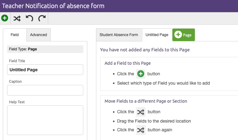
- Add Field: This button allows you to add new fields to the form. It is located at the top left of the form builder, and is a green circle icon with a + in the middle. (More about field types below.)
- Move Fields: This button allows you to drag and drop fields/pages within the form. It is located at the top left of the form builder, and is the icon of two arrows in the shape of an X.
- Undo: This button allows you to Undo actions. It is located at the top left of the form builder, and is the icon of a circled arrow going left.
- Redo: This button allows you to redo actions you have undone, it is located at the top left of the form builder, and is the icon of a circled arrow going right.
- Save: This button saves all changes made during the current session and exits the form builder. It is located at the top right of the form builder.
- Cancel: This button cancels ALL changes made during the current session and exits the form builder. It is located at the top right of the form builder.
-
CAUTION: One of the many reasons for creating a form is to update data about a specific user, a family or a guest. When you create a form, you choose one of those options. Once the form is published, this can't be changed. This selection has a very important function. If you choose to gather information about users or guests, the form will only link data from the User Info Form. If you choose to gather information about families the form will only link data from the Family Info Form.
- Types of Fields:
- Link a Field From User/Family Info Form: These fields originate/are created in the User Info Form or Family Info Form. These options will auto-fill for each user based on information already gathered and saved by the user. If the information chosen is not on file for a user or comes up incorrect, the user can manually edit the field.
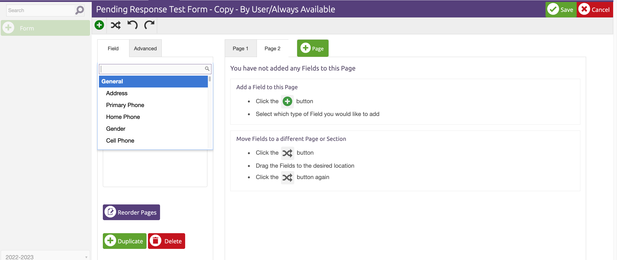
- Add an Un-linked Field: These fields are manually completed by the user. You can choose from the basic formats, or you can create a custom field.
IMPORTANT NOTE: When linking a field, the ONLY fields you will see in the pulldown menu are originated in EITHER the User Info Form OR the Family Info Form. You can't select fields from both (see the CAUTION above). If you have previously added a new field to the User/Family Info Form it WILL show up in the pull down list. **Some of the fields in the User/Family Info form have the same names (eg, Name, Address, Phone). Ensure you are linking to the correct field.
- Field Formats:
- Section: This will allow you to create a header where you can drag and drop fields.
- Custom Content Area: This field is for information purposes only. It will not have an area for the user to input a response.
- Text: This field will allow the user to type a short response.
- Paragraph Text: This field will allow the user to type a response, and will provide a larger text area.
- Number: This field will allow the user to type a number-only response.
- Yes/No: This field will come with a "yes" label and a "no" label build in. It will allow the user to choose one.
- Phone Number: This field is pre-formatted for a phone number.
- Email: This field is pre-formatted for an email address.
- Address: This field is pre-formatted for an address.
- File Upload: This field provides a button to upload files.
- Checkboxes: This field allows different format options and creates multiple choices to be chosen by the user.
- Radio Buttons: This field allows different format options for multiple choices but the user can only select one of the choices.
- Date: This field is pre-formatted for a date.
- Signature: This field is pre-formatted to accept signatures.
- Field Settings:
- In the Field tab (some settings are only available in certain fields):
- Field Title: The title of the field as it appears to users.
- Caption: Subtext to your title.
- Help Text: A field to let your user know whether they need certain information to complete field, or any other information you would like them to know. If you add Help Text, a small "?" will appear next to the Field Title.
- Required: The user will not be permitted to submit the form unless the field is completed.
- Min/Max: Character limits for the field (only applies to text/paragraph fields).
- Display Type: How the information is displayed in the form (only applies to Checkboxes and Radio Buttons)
- Choices: The different choices a user has when answering either a checkbox or radio button field.
- Default Value: If you would like the field to default to a certain response (only applies to yes/no fields).
- In the Advanced tab:
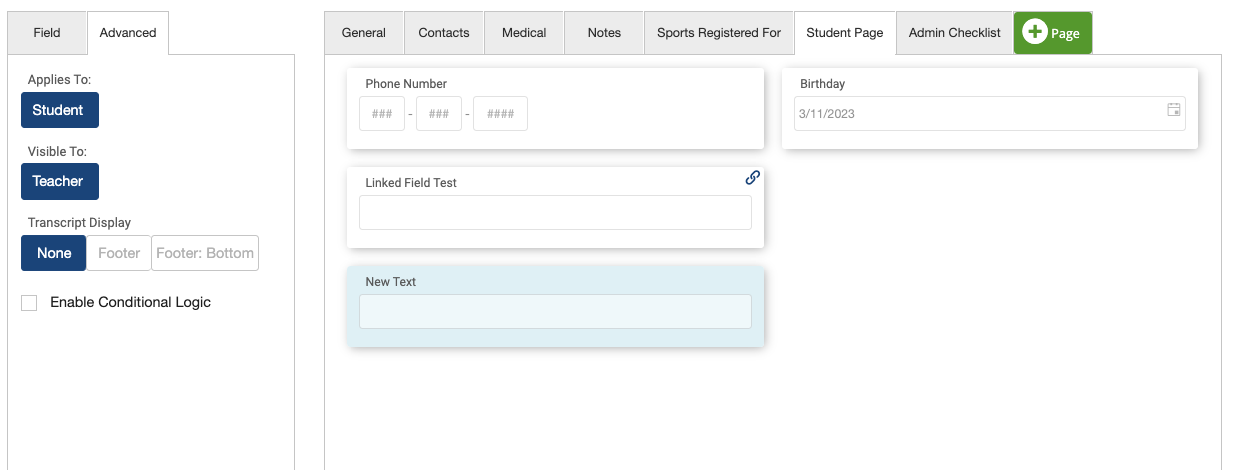
- Applies To: Choose to whom the field applies.
- Visible To: Choose who can see the field after it has been completed.
- Editable By: Choose who can edit the field after it has been completed.
- Transcript Display: this option is available only on the User Info Form. See our article Transcripts - Putting it All Together for more details.
- Enable Conditional Logic: covered in a separate article
- In the Field tab (some settings are only available in certain fields):
- Additional topics such as Adding Payments To Forms, Workflows and Form Responses are discussed in other Form articles.
- Once the form is complete and correct, click the Save button at the top right of the window.
Additional Functions
This section describes additional functions available after you create a form.
- Navigate to the Forms tab at the top of your screen.
- Navigate to the All Forms tab in the center of the window.
- Locate the form you would like to view or edit and click on it.
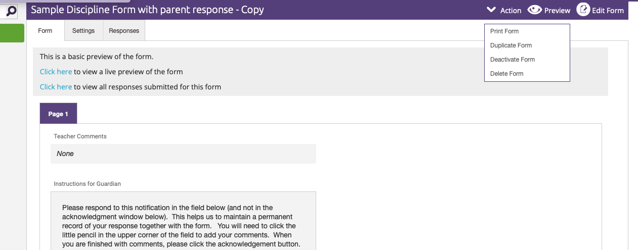
- In the upper right of the form page there are three options - Action, Preview and Edit Form.
- Action will give you a pull down with the following options:
- Print Form
- Duplicate Form - creates a copy of the form. This is especially useful if the form is published and you need to make changes to the basic set up.
- Deactivate Form - hides the form from your list of forms, but keeps it and all responses collected. At the bottom right of your forms list, you can select View Inactive Forms.
- Delete Form -Deletes the form and all its responses.
- Preview - allows you to preview the form as a specific user. Your response will show up in the list of form responses, however, it can be deleted.
- Edit Form - See above.
- Action will give you a pull down with the following options:
- In the upper left of the form page there are three tabs - Form, Settings and Responses.
- Form - a preview of the form.
- Settings - allows you to edit most of the settings/structure of the form. There are several tabs here - Form Settings, Confirmations, Admins, Workflow and Payments. These are all explained in different articles.

- Responses - you can view/edit both Pending and Submitted Responses to the form.